OverviewUIRect is the base component that both
Widgets and
Panels derive from. You won't be able to create it as a component it as it's an abstract class. Instead, create a Widget or a Panel if you want something tangible.
Video that shows the different anchor types in action:
http://www.youtube.com/watch?v=P8JTTE0JBXQ
All NGUI elements that have a modifiable area can be anchored to other elements or even 3D objects. When choosing an anchor point, you can decide whether you want all sides to be anchored to the same object, or different ones. Choosing
Unified will give you one option, while going with
Advanced will give you one per side.
To anchor a widget, move it in the desired position, choose one of the presets, and drag & drop the
Target you want it to be anchored to. The anchor's values will be filled in automatically.
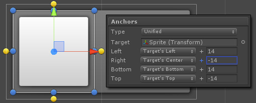
To set up a widget inside to always be "inset" in another widget, make it a child of that widget then choose the
Unified option. The target widget will be picked up automatically and the initial values will be filled in for your convenience. You can then further adjust the widget either in the scene view like you normally would, or by modifying the options.
Each side is anchored independently of the others, and for each you get to choose which of the 3 preset anchor points it will use. For example for Left and Right, they are Left, Center, and Right. If neither suit your needs, choose Custom and set the values yourself.
 Custom
 setting gives you a Relative value to work with. This value is relative to the target's dimensions, and as such will only be selectable when you are targeting another widget or a panel as the Target.
With a Left or Right anchor, 0 means left, 1 means right, and 0.5 means right down the middle. 0.25? 25% of the target's width from the target's left.
Choosing "Set to Current Position" will simply set the anchor point to where the side is currently positioned, making the offset be zero.

If you want more control, or if you want to anchor only specific sides, then
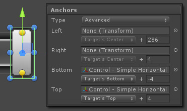
Advanced anchor type is what you should go with. With Advanced mode you can specify unique targets for each anchor point, effectively controlling which sides will be adjusted by the anchors, and which ones will remain as you left them. In the picture above I did just that for the slider's thumb: I chose padded anchors for the Top and Bottom, making them resize as the slider's height changes, but I left Left and Right as None. This means that resizing the slider horizontally won't affect the thumb.
You can examine this further by dragging in the Simple Horizontal Slider control into your scene and selecting its thumb.

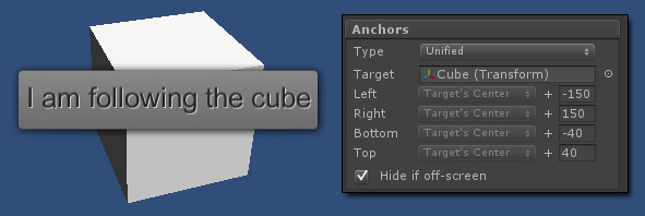
Last but not least, you don't need to specify widgets or panels as the Target. You could also specify a random game object of your choice in order to make the UI widget follow it. If your rectangle is on a widget, you can also make it automatically hide itself it it detects that it's no longer visible. Since the alpha is cumulative, doing so will automatically affect all of its children.
Class Documentationhttp://tasharen.com/ngui/docs/class_u_i_rect.htmlIf you have a question regarding this component or would like me to clarify something, just post a reply here.