Since the last dev post, I've been hard at work on the followup game to Windward. So hard at work that I've once again neglected documenting what it is I was actually
doing. Ahem. Well, the good news is the game is coming along very nicely and I've started letting a close pre-alpha test group of players have a go at it. The first one was all about exploring the gigantic procedural world. The second play test involved building bases. Now a third play test is on the horizon with the functional stuff added in (resource gathering and processing).
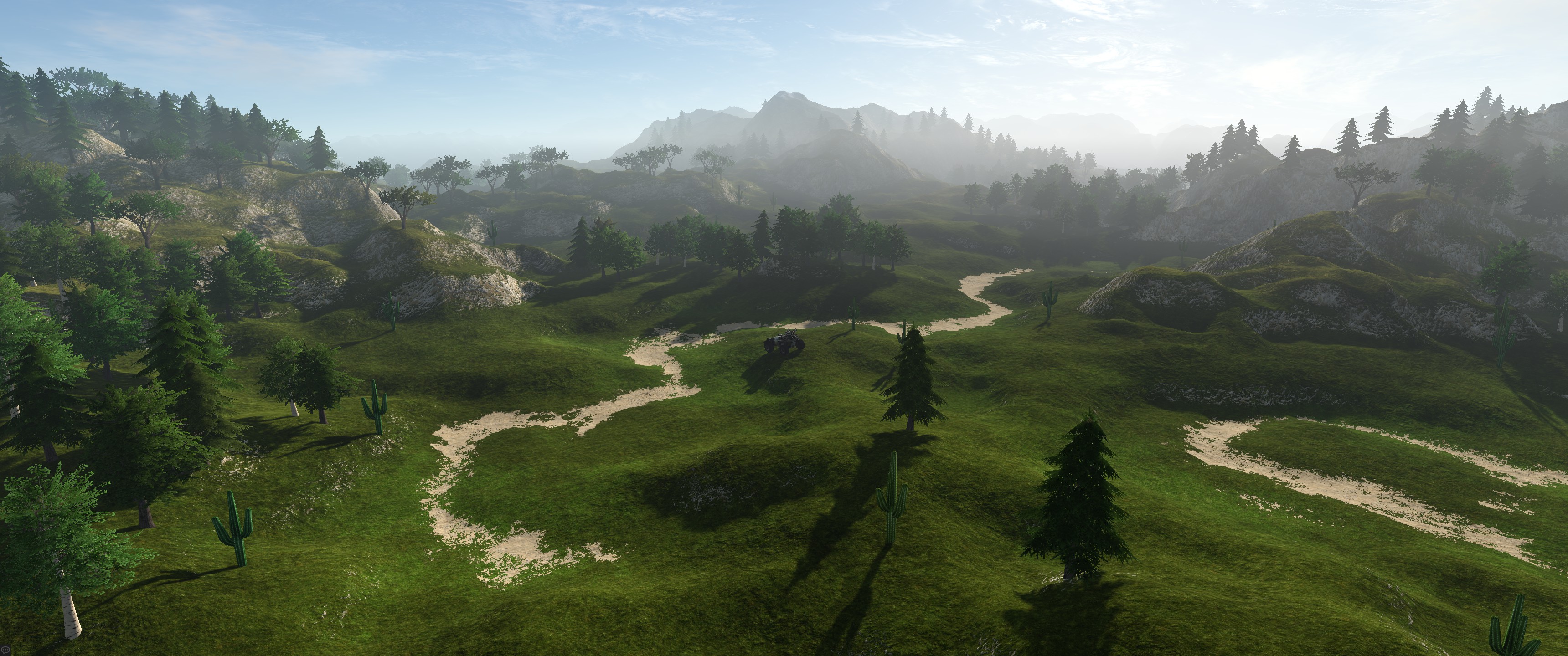
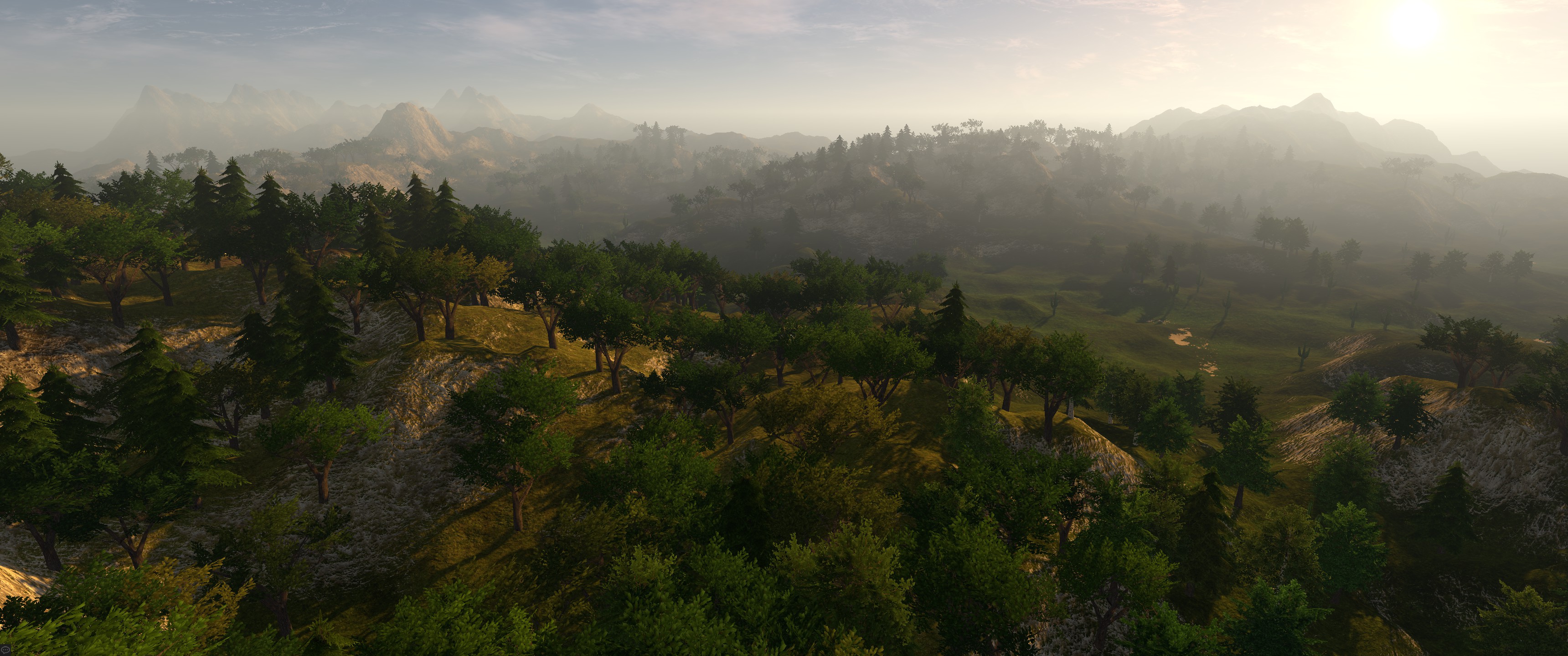
The game does look quite nice now, I'll give it that.


The only issue is finding suitable art for what I have in mind. The Unity's Asset Store is a fantastic place to find things, but every artist has their own distinct style, so simply taking different models and using them in the game is not an option. Plus, since I do have a specific art style in mind (clean, futuristic)
and I want the players to be able to customize colors of their own bases, I've had a couple challenges to overcome.
With the need to let players customize the look of their bases, I can't simply use diffuse textures. I also can't specify colors on an existing pre-colored material. That simply won't look well. Instead, what I need is a mask texture -- a special texture that simply defines which parts should be colored by which of the material's colors.
In Windward, my ship textures were also using masks. The Red channel was used to hold the grayscale texture. Green channel was used as the mask -- white pixels meant color A was used, while black pixels meant color B. Blue channel contained the AO mask using secondary UVs. In total, only 3 channels were used (and each ship only used a single 512x512 texture), which was one of the reasons why the entire game was only 120 megabytes in size. The final texture looked like this:

There were several downsides with this approach. First... having so much detail in two of the channels (red and blue) didn't play well with texture compression, resulting in visible artifacts. I could have technically made it better by moving one of them to the Alpha channel, but at the time I simply ended up turning off texture compression for ship textures instead. Second downside was only having one channel for color masking. This meant I could only have 2 colors, which is obviously not much.
For this new game (which still doesn't have a name, by the way!), I wanted to raise the bar a bit. I am targeting PC and Linux with this game (sorry Mac users, but OSX still doesn't support such half a decade-old features like compute shaders!), so all those mobile platform limitations I had to squeeze into with Windward are not an issue here.
First thing I did was split the mask information into a separate texture. To specify values for 4 distinct colors I only need 3 texture channels, with the 4th being calculated as
saturate(1 - (r+g+b)), but I also wanted to make it possible to mark certain parts of the texture as not affected by any color, so in the end I ended up using all 4 channels. The actual mask texture is very easy to create by taking advantage of Photoshop's layers. Start with the background color, add layers for second and third channels (red and green). Set all 3 layers to have a Color Overlay modifier for Red, Green and Blue, respectively. This makes it trivial to mark regions, and if necessary, have additional layers for details. It's much easier to work with layers than with channels, that's for sure. For the remaining (4th) color I just add another layer, set to have a Black color overlay. Black, because of (1-rgb) calculation used in the shader. This still leaves the alpha channel free, but as I mentioned I use it to mark certain parts of the texture that should not be color tinted at all. Fine details such as mesh grates get masked like that, and so do any lit regions, if there are any.
So that leaves the diffuse texture... Remember how I said that color tinting the existing diffuse texture doesn't look well? This is why my diffuse textures are very bright. The brighter they are, the better they get tinted. Pure white, for example. White looks great!

But wait, you might ask... that doesn't sound right. Where would the detail come from? Well, that's the thing... why have the detail be baked in the diffuse texture, when it can be separate? Not only does it make it possible to have higher resolution details separate from other textures, but it also makes it possible to have them be shared between different materials,
and even better still -- it makes it possible to swap them in and out, based on what the player made the object with. Take a building, for example. What's the difference between a building made out of concrete and one made out of bricks? Same exact shape, same exact ambient occlusion, same masks... the only difference is the base texture material, so why not make it come from a separate texture?
Better still, since I have 4 colors per material, why not have 4 distinct sets of material properties, such as metallic, smoothness, and the detail texture blend values? Well, in the end, that's exactly what I ended up doing:

This approach makes the objects highly player-customizable, and the final result looks excellent as well:

As an added bonus over Windward's approach, since the textures don't mix details in RGB channels, texture compression can be used without any noticeable degradation in quality. In the screenshot above the AO actually comes from diffuse channel's alpha and the normal map was created using a custom normal map maker tool I wrote a few months ago that uses multiple LOD/mipmap levels via downsampling to get a much better looking normal maps than what Unity offers. Not quite Crazy Bump good, but close! I'll probably end up releasing it on the Asset Store at some point if there is interest.